The Barnes and Noble eReader software for PC
25 comments Posted by Donavon West at 12/06/2009 09:27:00 PMToday the new version 2.0 of the Barnes and Noble eReader software for the PC launched. The new version was timed to coincide with initial customer delivery of the first nooks (Barnes and Noble's eReader device) and supports lending and eBooks, eMagazines and eNewspapers in the ePub format.
If you haven't ordered your nook already, you likely won't be getting one for the holidays. Unless that is, you are fortunate enough to find one at a local Barnes and Noble store. I hear that the flagship 5th Avenue store in Mew York City will have 13 available on Monday morning. My wife I overheard a bookseller at the local New Jersey store say that they will have three.
Labels: nook
As you may know, I'm actively looking for full time employment (my resume here). I received the following email today (corrected for spelling and grammar) with the subject line: Looking for your clone .... sort of.
Donavon,
I am working on a position for a client who needs a Strong JavaScript / CSS guy for front end development. They don't need Donavon strong and frankly, they can't afford you. Would you happen to know any sharp kid protégés who might be interested in a position in the Midwest working for a great company?
Please let me knowPS. Your resume ROCKS. I like the personality it shows and the testimonials are very impressive!
And here was my response:
LOL. Thanks (I think). I have a 9 month old son who is also looking for work. He's not as expensive as I am, but will need 2-3 naps/day so the client will have to be OK with that. :)
I'll let you know if I think of anyone else.
Donavon
Earlier today I released my first jQuery plugin titled jProgressBar. I am please to announce that I have a second free plugin available. It's called jToday.
jToday is an easy to use jQuery plugin that displays a "Today Is" like calendar view. How easy? The calendar icon in the sample above was created with one line of JavaScript (of course there is also some CSS backing up the style of the control).
Passing nothing will display today's date:
- $(".jToday").jToday();
Passing a Date variable will display any given date:
- $(".jToday").jToday(new Date(2009, 3, 27));
You can even embed a YYYY-MM-DD date string in the HTML div element (in which case passing nothing will not display today's date).
- <div class="jToday">2008-01-01</div>
Get the code
jToday is being offered on CodePlex. You can get the latest code here.
Labels: code, technology
I was recently asked by a headhunter if I had written any jQuery plugins. I said "No, but I could probably have one written by time we get off of the phone". OK, maybe a little cocky on my part, but not too far off from the truth.
Here is my first jQuery plugin. It is a simple ProgressBar. You could use it for many different applications. One example would be to display to the user the percentage complete he or she was in filling out a survey.
Before I get into the code, let me explain a little bit of what you are seeing to the left. The top jProgressBar uses an image. The next one subtly changed it's bar color from blue to white as the percentage increases. An finally, the sine wave that you see below is made up of 20 jProgressBars oriented vertically and two sine waves that are 90 degrees out of phase.
Using jProgressBar
Using jProgressBar is easy. Simply setup a get a jQuery object then call jProgressBar. In the example below, any HTML elements with a class of percentBar will be turned onto jQuery jProgressBar objects and initialized to a 10 percent full bar.
- var bar = $(".percentBar").jProgressBar(10);
Later, if you would like to change the percentage, you can call the method setPercent on any jProgressBar object. For example, the jProgressBar objects created above will now display a 50 percent full bar.
- bar.setPercent(50);
You can also pass an optional second argument during the creation of your jProgressBar to specify settings. For example, let's say you wanted your bar to be 125px wide. You could do something like this:
- var bar = $(".percentBar").jProgressBar(0, {width:125, height:50});
Settings
Here is a list of all of the jProgressBar settings and their default values:
| width | width of the jProgressBar (default=100) |
| height | height of the jProgressBar (default=12) |
| orientation | 0=horizontal, 1=vertical (default=0) |
| border.width | width of the border (default=1) |
Style
The style of the jProgressBar is controlled through CSS. You can set border, background and bar sub selectors. Here is the CSS that I used on the top jProgressBar in my sample above. The border is set to a solid color of black, the background (the space not occupied by the bar) is set to white and the bar itself is made up of an image.
- .jProgressBar_Green .border {
- background-color: #000000;
- }
- .jProgressBar_Green .border .background {
- background-color: #ffffff;
- }
- .jProgressBar_Green .border .background .bar {
- background: #6dd436 url(images/jProgressBarBackground.png) right top;
- }
Get the code
jProgressBar is being offered on CodePlex. You can get the latest code here.
Labels: code, technology
For years we've been presented with dialogs and web pages that ask us OK or Cancel. But what order do they belong in? I've always placed my action button (e.g. OK, Save, Yes) to the left and the negative action (e.g. Cancel, No) on the right. This came from growing up on Windows. Mac people do it backwards (in my opinion), placing the OK/Cancel buttons in reverse order (i.e Cancel/OK).
The Apple Human Interface Guide states:
Always put the action button in the bottom-right corner of the alert. This is the button that completes the action that the user initiated before the alert was displayed.
In other words, Apple says Cancel/OK as shown here:

Microsoft's Windows User Experience Interaction Guidlines state:
Place command buttons that apply to all property pages at the bottom of the property window. Right-align the buttons and use this order (from left to right): OK, Cancel, and Apply.
And as you can see, Microsoft says OK/Cancel as shown here:

What do the popular web sites do?
So much for the OS. How does this translate into apps for the web where the OS is not the one who positions the buttons? Let's take a look at some popular web applications to see what they do to try and answer the question: Should you code your buttons OK/Cancel or Cancel/OK?
Google Apps: OK/Cancel

Facebook: OK/Cancel

Evernote: Cancel/OK
The people at Evernote seem to have come from the Mac world. In fact, the Windows desktop version of the application even has a Mac OS X Spotlight looking search box (see below). It's no wonder they chose Cancel/OK.

PayPal: OK/Cancel

And the winner is…
It's pretty clear that the majority of the web community has embraced the OK/Cancel format. But here's one more site that I'd like to show you. It does what I believe is the best way to present choices to the user on the web.
LinkedIn: OK/Cancel*

As you can see, they use the OK/Cancel left to right format, but are using a button for OK action and a link for the Cancel or negative action. This allows the user to quickly perform the task they intended to do, yet still provides them with a mechanism for canceling the operation.
So to answer the original question "Should you code your buttons OK/Cancel or Cancel/OK?", then answer is OK/Cancel, but with an asterisk. You should use a button for OK and a link for cancel. As always, this is only my opinion. You particular situation may require a different approach.
Labels: technology, website

Yeah it's me. I know, I know. No post is over two months, but I had a free moment and thought I'd let everyone know about an article on Microsoft TechNet about how to backup SBS (Small business Server) to a WHS (Windows Home Server).
Read the entire article on TechNet.
Oh and what have I been doing for all this time? Looking for a job! This is where I plug my resume. Check it out on http://donavon.com/resume/.
Run IE6, IE7 and IE8 Side-by-Side on Windows 7 RTM
161 comments Posted by Donavon West at 8/14/2009 02:31:00 PMOk, not exactly, but… you can get the same effect using Microsoft Virtual PC with XP mode and run IE6 and IE7 as "virtual applications". You'll need to be running Windows 7 Ultimate and the free Windows Virtual PC and Windows XP Mode.
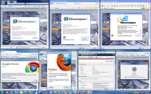
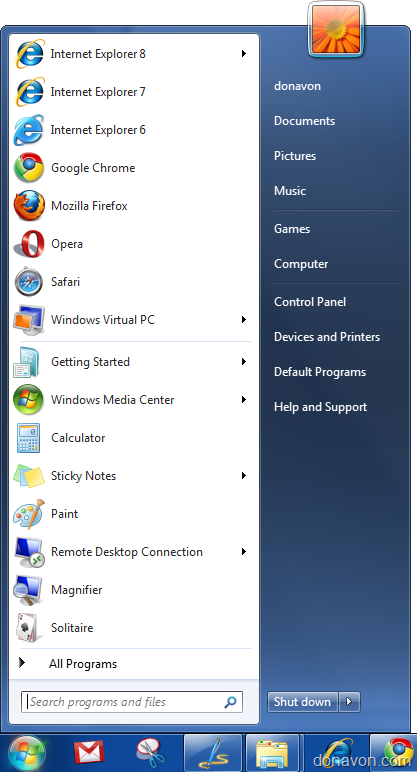
The screen shot above (click to enlarge) shows the 7 major browsers running on my Windows 7 Ultimate RTM desktop, including IE6, IE7 and IE8! Pretty cool when you need to do compatibility testing. I've also pinned all 7 browsers on the start menu.
Want to know how I did it? Let's get started.
- As stated above, you'll need to be running Windows 7 Ultimate for this to work (Ultimate is required to run virtual applications).
- Install the free Microsoft Virtual PC from Microsoft.com.
- Then download and install XP mode (from the same web page). XP mode is actually a free version on Windows XP SP3 pre-installed onto a VHD.
- Now launch Windows XP Mode (click Start, type windows xp mode and press enter).
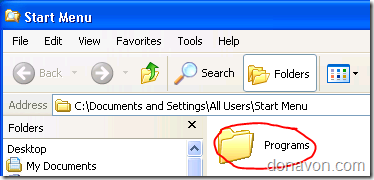
- Right click on the Start button and select Explore All Users.
- Double click on the Programs icon
- Drag the Internet Explorer icon from the desktop into the folder. This will create a shortcut to IE6. Windows 7 will Auto Publish any links create in All Users to the host system. Click Start, All Programs, Windows Virtual PC, Windows XP Mode Applications to see the link to IE6 that you just created.
- Next we'll Create a second XP virtual machine and install IE7.
- Click Start, All Programs, Windows Virtual PC, and Windows Virtual PC again.
- This will open up the Virtual Machines folder.
- Next click on Create Virtual Machine.
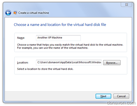
- Give your new XP virtual machine a name and click Next.
- Chose a RAM size and click Next (I left mine at 512k).
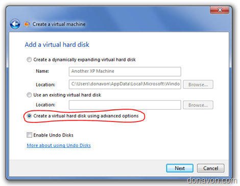
- Select Create with Advanced Options and click Next.
- For the VHD type, select Differencing
- You can leave the next screen at it's defaults and click Next.
- Now we need to specify the location of the base Windows XP image differencing disk (VHD). It should be installed at C:\Program Files\Windows XP Mode\Windows XP Mode base.vhd
- Click Create and you are all set. It should appear back in the Virtual Machines folder view.
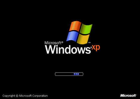
- Double click on the new virtual machine. It will take several minutes and you will see the Windows XP startup screen, then some setup screens. Follow along with first time the setup process. The whole setup takes 5-10 minutes.
- Eventually you will be at the desktop with XP fully installed.
- Now let's install the Integration Features. This first time you do, you will be asked to enter your credentials. Enter Administrator as the username and enter the password you selected during XP setup. Remember to check Remember my credentials.
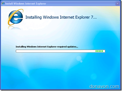
- On the new virtual machine, launch IE6 and go to the IE7 download page on Microsoft.com and install IE7.
- You will probably be asked to reboot the virtual machine.
- After the reboot, run Windows Update on the virtual XP machine. This will install any critical updates need for IE7 to run.
- Just like we did before for IE6, right click on the Start button and select Explore All Users.
- Double click on the Programs icon
- Drag the Internet Explorer icon from the desktop into the folder. This will create a shortcut to IE7. If it worked, you should see this:
You now have IE8 (running natively on Windows 7 Ultimate), IE7 (running in the virtual machine we created) and IE6 (running in the default virtual machine) running and you can enjoy single machine browsing and testing on all major browsers!
Labels: internet-explorer, technology, windows7

