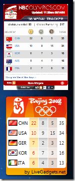
 At the time I released the Beijing 2008 gadget for Windows Vista, I had no idea that NBC had an official Windows Vista Sidebar version of their own (written for them by Clearspring).
Here they are side-by-side on the Windows Vista sidebar. I’m not kidding you folks, this is a full sized untouched screen shot. Notice how small the text is on the NBC version. In some cases you can’t even read it (i.e. does China has 33 or 35 medals)? Also notice how pixilated the “NBCOLYMPICS.COM” title is. And what’s with the white background surrounding the red border?
I don’t mean to knock them too much but please! In Clearspring’s defense, this is a wonderful gadget when running as a web widget where the gadget is displayed in a larger form. But how could NBC even think of releasing such a piece of @#*! for a Vista Sidebar gadget!
When will some people learn that you can’t always create one widget that works perfectly for the web and for the Sidebar. Hey, NBC. Next time you need a Vista Sidebar gadget, call me! :)
If you have a blog or website, I do recommend the various NBC Olympics widgets. Also check out NBCOlympics.com for complete Olympics coverage. You can also watch Olympic content directly within Windows Media Center on PCs running Windows Vista Home Premium or Windows Vista Ultimate.
4 comments:
- Justin Thorp said on August 14, 2008 at 9:18 PM ...
-
Hi, my name is Justin Thorp and I'm the Developer Community Manager at Clearspring. I really appreciate your feedback about our support for Windows Vista Sidebar. I'll be passing it up the food chain.
Sometime I'd love to hear more of your feedback about the platform. Can you drop me a line? - justin@clearspring.com - Donavon West said on August 14, 2008 at 10:29 PM ...
-
@Justin - I had previously passed along similar private comments to Dylan when we were out at Mix08. That was in regard to the Elections count gadget, which was also unreadable when on the Sidebar.
After nothing visibly changed in the Sidebar design, this time, I decided to "go public" with my opinions.
I also wanted to point out to the MSNBC folks that this is not an elegant solution (as I'm sure you agree).
I understand your wanting a "Flash Everywhere" solution. While this works great on the web (as Clearspring has shown time after time), it has drawbacks on the Windows Vista Sidebar. - Justin Thorp said on August 15, 2008 at 12:02 PM ...
-
@donavon, I don't think our goal is to have flash everywhere. It's to provide a solution where developers/publishers can take their content and get it out to the widest variety of people as easily and quickly as possible. Right now flash is the best option.
This type of write once read everywhere solution is going to always have drawbacks.
As far as their being white under the widget, Vista cannot handle Flash transparency against the desktop.
I really appreciate your comments! I've already started having a conversation with our engineer who's in charge of desktop implementation. - Donavon West said on August 15, 2008 at 1:41 PM ...
-
"This type of write once read everywhere solution is going to always have drawbacks."
These drawbacks are exactly why it shouldn't be used on the Sidebar.
Even more important to appearance, you should also consider the security risks posed by your design. You are leaving the user vulnerable to MitM attacks that could compromise his/her system. Microsoft does not allow such methods to be used in it's Sidebar gadgets. My gadgets designed so that they are not open to such attacks.
Microsoft found and correct three of their gadgets that had the problem.
I suggest that you read the article Inspect Your Gadget for clues on how to correct your gadget design before anyone gets hurt (or sued).
Oh and I AM available for consultation if you need any more information. But be aware that I'm not cheap! :)
Post a Comment